Sunday, 28 June 2009

What a concert!! Go and see P!NK if you possibly can


I have only been to a few concerts, but they have all been fabulous, U2 and Billy Connolly for example. However, last night's P!NK concert has to have been the best of them all for energy, showmanship and plain old talent! I went with Carolyn, a demonstrator in Kim's team, so she's a sideline of mine, an SU sista. With us was Donna, Carolyn's cousin Carolyn's wheelchair bound, and the seats she had access to were brilliant! THANKS Carolyn for thinking of me when you had a last minute spare ticket, and YES! I'll be going with you again when she's next in town. It's a rare find to watch someone who has true singing and songwriting talent as well as a fine insightful intelligence to go with it :)


How anyone can be hanging from the rafters by bungee cords and trapeze harnesses, upside down, and still be singing their heart out without skipping a note is totally beyond me. Her band is incredible, and we were treated to some guitar and drum solos while P!nk made some speedy costume changes.


It was also fascinating to watch the audience - there were pre-schoolers through to grandparents and everything in between, and I'd have to say that everyone looked like they were having the best night!


I took LOTS of photos, and some of them turned out pretty well, given the limitations of distance, zoom and lighting. I've put a few here, and I can heartily recommend that if you can get to a concert and you are in anyways a fan of her music, GO!

Thursday, 25 June 2009

Cute :)


Well, I am SO not a football fan, especially not Rugby League. My husband isn't all that keen either, but did flick to the channel from time to time to see the NSW Blues getting beaten. He took this photo last night and I thought I'd share with you. It's Bentley the British Blue, no longer a kitten at almost 5kg!! Might as well be a NSW Blue by the way he's hiding his face I reckon (and his usual sleep style is all sprawled out and upside down, so this is not standard behaviour!) Hope it gives you a little giggle :)


In other news, there are a couple of places available for my Stampin' Crop THIS SATURDAY, from 10am till 5pm. Give me a call, 9484 9447 to book in. And, I'm off to the P!nk concert on Saturday night because a friend had a last minute spare ticket. Wooo Hoo! Thanks Carolyn!

Friday, 19 June 2009

Upsy Daisy with a dash of Kiwi Kiss

I wanted to try a different look for the lovely and popular "Upsy Daisy" stamp set, so I experimented with embossing with the Stampin' Up dye inks combined with Versmark. Yes, it can be done! There is a trick or two to the technique, but it means you are able to match your embossing to your Stampin' Up! cardstocks easily.


* First, ink up the stamp very thoroughly with Versamark ink.


* Next press the Versamarked stamp directly onto the dye inkpad, taking care to press down firmly to get good ink coverage without smudging or twisting the stamp - you want to add a layer of dye ink over the top without rubbing off any of the Versamark.


* Then stamp onto your cardstock, and pour over clear embossing powder straight away - the combination of dye + Versamark inks still dries a little faster than pigment inks.


* Heat with your heat tool, voila!

The card base is Pink Pirouette, and I ran a strip of Kiwi Kiss cardstock through my crimping tool. I sponged the edges with Kiwi Kiss ink. Edging the strip are pieces of Whisper White punched with the Eyelet Border punch.

The embossing is done with Pink Pirouette ink and clear embossing powder, described as above, and then I matted the Whisper White piece with Pink Pirouette and Kiwi Kiss.

To finish, I stamped a greeting from Pocket Silhouettes, which fitted nicely onto the tab punch. A piece of Pink Pirouette striped grosgrain was tied through the fold of the tab before sticking down.


Ta da! hope you like it


Wednesday, 17 June 2009

Make Life Prettier with Paper and Stamps!


Here are a couple of projects I have made to make my everyday essentials look a little more attractive.


The first project was to cover my brain. Yes, that IS my brain, well, at least a very important external adjunct of it. I have pretty much always needed to carry a notebook with me to jot things down in, being a list maker from way back. But now, with 2 kids and a pretty full-on schedule, I find it absolutely critical, or important things tend to fall through the holes! I used Bella Bleu Designer Series papers and the matching cardstock colours of Kraft, Very Vanilla and Not Quite Navy. I used the Spiral punch to make the cardstock fit the wire binding cover, and added a few extra snips where necessary (different brands have different pitch for the wire spacing) I then tied some ribbon scraps around the wires, which hides them nicely and adds interest. I stamped some Damask images from Friends 24-7 on the Kraft, using Sahara Sand ink, and on the Very Vanilla band at the base of the layering with the different matching cardstocks and couple of different paper designs. The label is made with the scallop circle and circle punch, and I made the title with the Calendar Alphabet - nice small letters so great for personalised greetings and sentiments. I can't remember where the "the" came from right now, but it was part of a sentiment from a current set that I inked up in marker. I have also used the very pretty Eyelet Border punch, and tied some hemp twine and tafetta ribbon around the band before adhering. I made a bookmark from a piece of Vanilla tafetta, threaded with some beads from the Pretties kit. At the base, which I accidentally chopped off in the picture is a filigree brad with a clear rhinestone brad in the centre. Purty, no? Purty useful anyway!


Next up is my boring black office diary. I buy my diaries for functionality rather than looks, but I figured it sure could use some dressing up!! I was concerned about the longevity of the finish, and intended spraying it with some sealant, but haven't gotten around to it yet, and several weeks later it looks almost as good as new. The top section is Barely Banana textured cardstock. an the bottom layer is smooth Not Quite Navy cardstock. The centre band is a section of the same Bella Bleu DSP that I used for the notebook, and Kraft Eyelet border. I stamped a floral image from the now retired Natural Beauty set, and the butterflies are from the Dreams du Jour set, along with the centre image for the circle motif. I inked up the Dreams image with markers to make it multi coloured and stamped onto Very Vanilla card. There is an Ice rhinestone brand in the centre. behind this is a yummy piece of So Saffron striped grosgrain ribbon. The "Life" sentiment is from the Live Like you Mean it hostess set, and 2009 is from the Calendar alphabet - a must have in your collection!

Tuesday, 16 June 2009

Stampin' Crop Day - Saturday 27th June

My monthly open-house style Stampin' Crop day will be held at my place in Cherrybrook on Saturday 27th June. It runs from 10am till 5pm, and you can come and go as you please during that time. It is a casual day, designed so you can catch up on your current projects, and you are welcome to use my tools and stamps to try something new. I usually do some informal teaching, and a demonstration or two, which you can choose to participate in, or carry on doing your own thing.


What to bring? - Your basic papercrafting tools such as trimmer, bone folder, adhesives, and whatever projects you are keen to finish (or start!!)


What's provided? - Tea, coffee, light snacks, table lollies, use of my extensive collection of stamps and tools.


Lunch is available from a local shopping centre about 3 minutes walk away, or bring your own.


Cost? $10.00 for the day.


How to book in? - Give me a call on 9484 9447 or email me michelle.dyson@bigpond.com to reserve your place - there are limited places and I have been booked to capacity the last two months, so don't delay!
See you there!!

Friday, 12 June 2009

Thoughts and Prayers - a versatile set, an Oops and a RAK


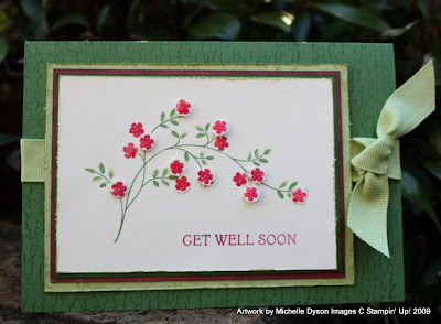
Thoughts and Prayers, p48 of the Idea Book, #115888 and just $45.95 is a must for your collection. It has some beautiful images, in the Silhouette style, there is a branch with blossoms and also an elegant tree. More importantly, the sentiments are just right for those more difficult card making occasions - sympathy, get well and for other less than pleasant life moments. I like it in particular because there is a choice of both religious and non-religious wordings. I have seen so many different techniques and occasions used with this set, even though it is new to the catalogue this year, and I have experimented with it here, for both a Get Well and a birthday card.


The Get Well card has a little oops on it, first person to correctly tell me what I have done to make it 'go away' will win a little RAK pack.

The card bases for both cards are Garden Green, stamped in Garden Green ink with the Weathered Background. Then we have various layers of Certainly Celery, Rose Red, Garden Green again and Very Vanilla. I have distressed the edges, and have used Versamark ink to add all-over pattern to some of these layers with the Tree stamp. This creates a subtle tone-on-tone effect, and you can achieve a similar result by using the matching ink and cardstock, ie, Certainly Celery ink on Certainly Celery Cardstock. I often head for the Versamark though, as then I don't have to clean the stamp so often!!

For the images, I have used my markers to colour up the stems, leaves and blossoms, and have used the 'thumping' technique to mix both Garden Green and Certainly Celery to the leaves. I have used Rose red for the little blossoms, and popped some up with Stampin' Dimensionals foam dots. To finish, I added some Crystal Effects dimensional adhesive glaze to make them shiny, this also intensifies the colour. Lastly, I have tied on some wide celery grosgrain ribbon.


I hope to have more of a play with some other occasions and colour schemes, be back later to cement this set's position on YOUR wishlists!!!

Sunday, 7 June 2009

Fifth Avenue Floral - and more philosophy!


Here's another card I have made recently, and it was used for a couple of workshop Make n takes in May also, so quite a few people might think it looks familiar!! It uses the set "Fifth Avenue Floral", which didn't appeal to me instantly, until I saw what a few people were doing with it. It is very versatile, always a good thing with a stamp set, and is easy to work with because there is also matching Designer Series Paper to go with it - Urban Oasis. In fact, one of the designs in this pack was the inspiration for the colour scheme and design of this card. It is the large multi floral design on a white background, and I have used the same colours and the floral stamps to recreate the paper pattern on a smaller scale for the card panel. Colours used are: Baja Breeze, Kiwi Kiss, Basic Grey, Sahara Sand and Kraft. I have also used the "Sanded" background to add some depth to the card base. The scallop edge punch has been used for the Basic Gray panel edge. The sentiment is another valuable piece of philosophy that is appealing to me - "You only live once, but if you do it right, once is enough" - apparently by Mae West. I had one group say that the card would need to be "for an old person" - but I don't think so!! Live your Sunday and Holiday Monday to the fullest peeps!

Saturday, 6 June 2009

Mini Gift cards and more Live Like you Mean it!

Here is another one of the Make n Takes from the recent Stampin' Up! Convention in Canberra. It is a nifty idea for a gift. It is a little package of mini gift cards, again using one of the convention sets, Trendy Trees. The mini cards each have a different tree stamped on them, but use the same format, so they were super fast to do. To finish, all that was required was a Cello bag, and a piece of Designer Series Paper cut to size for sliding inside. This adds that special touch, I think. The Word Window punch takes on a new skill making a wide slot for some Wide Stitched Chocolate Grosgrain ribbon. The colours on the cards are Baja Breeze, Old Olive and Whisper White. Cute hey! You could adjust this to use lots of sets, with a series of co-ordinating images, think Circle Circus, Pun Fun and lots more.


I really love the sentiment from this set, Live Like you Mean It. It goes quite well with my general philosophy on life. I heard another good quote tonight, from P!NK, wistfully watching the V Music Channel special, wishing I was going to one of the concerts on this weekend in Sydney. (spare ticket? Call me!!) Anyway, she said that one of her important life lessons was "Don't let anyone rob you of your joy" And I LOVE making cards! Each and everyone brings me a little bit of joy, both in the making and the giving.


Onto the card! The base is Barely Banana textured cardstock, which gives a distressed look to stamping, sort of like canvas/linen. It is stamped with Perfect Plum and Pale Plum, and the stems were inked with Certainly Celery marker. This is a 2 step stampin set if you wish to use it like that, and it is quite easy to do freehand, as the set has a casual feel to it. I stamped a row of the stems up the right hand side of the card, and added the sentiments to the left. I added some Crystal Effects dimensional adhesive over the LIFE, to give it some gloss and a raised look, although it doesn't show up all that well in this photo. I was umming and ahhing about a bit of ribbon to finish it off, and had selected some narrow celery grosgrain, but decided on a bit of stray pre-SU ribbon, which serendipitously had all the colours I had used to make the card. I chose the colours with the Colour Coach by the way, I am loving this tool at the moment!

Hope you like these, PLEASE leave a comment to say hi! It is nice to hear from you, whether you stumbled across my blog erroneously, or are a regular visitor. I often get the sense that I am chatting away to myself otherwise!

Thursday, 4 June 2009

Live like you mean it

Here is another card I made at the Stamp Camp weekend at Collaroy. It uses two Level 1 Hostess-exclusive items, so if you want to make it yourself, contact me me to organise a workshop, catalogue party or cut that Wish List down to a more manageable size with an order of $300 or more - there is a great selection of goodies to choose!


The stamp set I have used is "Live like you mean it", and the Patterned paper is from the Patterns Pack II Designer Series paper pad - a block of 60 sheets of 6x6 DSP in 5 different colours.

The base of the card is Whisper White, and I've stamped the 'Life' and sentiment in Regal Rose to match the DSP. A panel of the patterned paper is laid over a mat of Regal Rose cardstock edged with the gorgeous Eyelet Border punch at the top! Whisper White Craft ink has been used to stamp the flowers directly on the patterned paper, and a layer of cut-out flowers inked up with Certainly Celery, Regal Rose and So Saffron markers is positioned in front, so it looks (I think anyway!) like a bed of flowers going backwards. A snip of narrow Certainly Celery grosgrain is the finishing touch. Hope you like it!

Tuesday, 2 June 2009

Trendy Trees! Convention Make n Take

Trendy Trees is a very cute set, so easy to play with colour and technique. You can find it on page 99 of the Idea Book and Catalogue, and it's a BARGIN! at just $31.95 for the set of 8 stamps. Check out the matching wheel for even more versatility, think themed party invites, decorations and more!!


This card is one that was designed for us at Convention 2009, in Canberra a few weeks back. The base is textured Chocolate Chip, and then there is a layer of Old Olive. A Stamp-a-ma-jig helps with placement of the trunks and branch sections, but there is a fair bit of room for flexibility if you don't have one (why not!!?? I must ask!!) - it looks good even if they don't line up just-so. Colours used to stamp with left to right are So Saffron, Old Olive, then Pacific Point at the far right. The remaining tree uses a fun technique called Rock n Roll. First the multi-leaved stamp was inked in So Saffron, then the stamp was rolled across a Tangerine Tango inkpad to pick up some colour around the outer edges. Finally, just the very edges were rolled onto a Riding Hood Red inkpad. Instant Autumn colour!! To make it pop, it has been mounted on Stampin Dimensional foam dots.


To finish, Riding Hood Red striped grosgrain ribbon has been tied around the card under the Whisper White stamped panel. The word Thanks from the set's Thanks so much sentiment has been inked onto a scrap label of So Saffron cardstock, and tied around the knot with a bit of hemp twine. Very easy, very effective!