Thursday, 29 April 2010

Gift Vouchers and Mothers Day Cards with Vintage Vogue, Manhattan Flower and Pendant Park


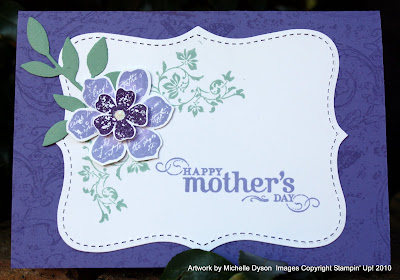
Here are some of the cards I've made over the last week or two in preparation for Mother's Day - Sunday week, 9th May. Would you like to receive some Stampin' stuff from your family?? It's not too late for delivery in time, orders placed by Monday 3rd should be fine for the eastern states.
And, for those hubbies who tend to leave things until the last minute, you can save their bacon by dropping hints about my gift voucher service. These can be posted anywhere in Australia, with a free hand-made card, and can be made out to any value you like. Something to remember if they forget completely and you wish to maximise the guilt value!!

OK, so the top card is one we made at my Autumn/Winter Mini launch last Saturday. It started with an idea of using the 2step Bird punch to create a big and little bird like this one I saw on Valita's Fresh Folds blog. She's a clever girl that one!
I had a brainwave when I'd made one large and one small bird - to make them into mother and child bird for Mother's Day.
The card base is Soft Suede, the overlay panel is Naturals Ivory, and I used my Circle Scissor to cut the two concentric circles in Kraft and Very Vanilla. I stamped the gorgeous tree from "Pendant Park" in Soft Suede ink onto the Vanilla circle. All of the layers were sponged with ink for definition.
Now for the birdies: The Mummy bird is straight from the punch, but with the addition of long stick legs cut from Soft Suede. Baby bird's construction really highlights the versatility of this punch (get you wishlist and pen handy, because you're gunna want this punch on there!!) Baby's body is the wing piece!! Same stick legs, but shorter. But what about the beak and baby wing?? Ah! So clever - they are simply two leaves cut from the branch and glued into position.
The layers have been sponged with Soft Suede ink for definition, and I added an eye with Chocolate Chip marker and a dot of white gel pen. The band is constructed from the border stamp in the "Pendant Park" set, stamped onto Naturals Ivory. Behind this is a scrap of Soft Suede Designer prints paper - not available here in Australia, but as Soft Suede will be joining the core colours come September, I have high hopes for its inclusion in the next catalogue. The sentiment is from the brilliant "Teeny Tiny Sentiments" set, also new in the A/W Mini and I finished with a scrap of Polka dot ribbon in Soft Suede.


Back later for the deets on the other cards, off to have a play with some new goodies!

Wednesday, 28 April 2010

Quick easy (anything) cards with Manhattan Flower

There is very nearly no stamping on these cards. Other than the background stamp on the Riding Hood Red panel and the Tiny Tag, it is all simple embossing and ribbon. You could get away with no stamping at all if you substituted a patterned paper for the red panel and added something else embellishment wise to the ribbon. Very fast, very easy, very effective! I made about 8 of these in about an hour, with a few different variations of ribbon etc. The folder is the utterly scrumptious "Manhattan Flower" Textured Impressions Embossing Folder from the new Autumn/Winter Mini catalogue. It is designed to go through the BigShot diecutting machine also new in the mini, but goes equally well into other brands of roller diecut machine such as Cuttlebug, Big Kick etc. The folder complements the "5th Avenue Floral" stamp set and the "Urban Oasis" Designer Series Paper, but it works just fine all by itself. Here I have used Whisper White as the cardstock, being so densely compressed it gives a lovely crisp finish. I have also used this folder with Glossy White cardstock with great results. The card base is Kraft, and the ribbon is Baja Breeze striped grosgrain and Kraft Taffeta, tied on with Linen Thread. What do you think?

Sunday, 25 April 2010

Colour Renovation! Make your list and check it twice...


Exciting changes are ahead for Stampin' Up!...


Here I have paraphrased the Press Release from Stampin' Up! Headquarters, since it describes more eloquently than I can what it's all about. I've also changed the dates to reflect the schedule here:

Color is uniquely personal. Some people are drawn to soothing, soft shades, and others relish energetic, vibrant colors. Regardless of color preference, Stampin' Up!'s renovated color collections available September 1, 2010 has something that everyone will love. The company extensively researched trends in fashion, design, paper crafting and home décor for almost two years in addition to holding focus groups with customers and demonstrators to decide on the palette of colors that would make up the color renovation.


The renovated color collections will include 25 carryover colors, 10 returning In Colors (which are now core colors), 5 new core colors, and 5 new In Colors, for a total of 45 colors. The company will continue to offer five new In Colors each year, and In Colors will have a lifespan of two years. Colors are divided into four collections: Subtles, Brights, Regals and Neutrals.


"We're thrilled with our color renovation," notes Shelli Gardner, co-founder and CEO of Stampin' Up! "We've always been known for our color coordination. These new collections allow us to continue our commitment to that approach, and combine it with an exciting new line of fresh, vibrant colors. Each collection is so beautiful, people will have a hard time choosing which collection is their favorite."


The new color collections offer many versatile choices, and as always, include a wide variety of coordinating products and accessories. Whether you have a color collection already in mind, or you want to explore the options available in Stampin' Up!'s complete line, you'll want to see the exciting new world of color for yourself.


So, what does this mean for you? Take a look at the newly re-organised collections. You'll see many of your current favourites, some of them have moved house though! The collections look updated, refreshed and rejuvenated, and you're also going to love having some of your old "In Colors" back - including Wild Wasabi and River Rock!


There are 29 colours retiring, which means they will be unavailable after 31st August. Many you won't miss at all, perhaps you've never used them (perhaps a clue as to why they're leaving us!!) Others, such as Close to Cocoa and Mellow Moss, Pale Plum and a few more are going to be missed, a little, at least until you come to love their replacements. Please please please check your collection, and ensure you have a reinker for any inkpads due to retire, and perhaps a small stash of cardstock to complete any projects. Just give me a call and I'll be happy to ensure your investment in our colour system will continue to give you crafting pleasure for many years to come!

Top Note Cottage Wall Quilt Card

This one I love! It's one of the cards I made at the e2c retreat late one night. I had seen some examples of using the Top Note die as a base for a pieced paper quilt, but this is my first go. I wanted to work with the gorgeous Cottage Wall Designer Series Papers from the Autumn/Winter Mini catalogue. These papers co-ordinate perfectly with the Cottage Garden stamp set, and the colours are Rich Razzleberry, one of our new In Colours, Orchid Opulence, Old Olive and Whisper White.


The first step was to cut 1 1/2" squares of the paper. Being double sided, there is a great mix of patterns, it was much easier than getting things to look good with fabrics! I also added some cardstock squares, but cut from an embossed panel made with the Manhattan flower embossing folder, for some textural interest. I glued these to a cardstock base slightly larger than the finished top-note die, and then cut the shape on the Big Shot machine. The stitched look around the edge is part of the die, so it really does look like quilting. I added some more faux stitching with my white gel pen.


The card base is Rich Razzleberry, and I stamped all over in Razzleberry ink using one of the smaller stamps in the Cottage Garden stamp set. Then I attached the quilted top note. I stamped more of the flowers and butterflies from the Cottage Garden set onto Whisper White cardstock and cut them out, layering them over the Quilt. To finish, I added the sentiment from the stamp set cut out with the Wide Oval punch.


Hope you like it too, I'm keen to make a real scrap quilt out of scraps of various patterned papers.

Thursday, 22 April 2010

It's Melon Mambo 6 and 7/8ths!

Sorry, everytime I write Melon Mambo at the moment I am reminded of a line in the Bob the Builder CD currently playing in my car... It's a very catchy version of the Lou Bega Mambo No. 5. But being a builder, Bob's more accustomed to fractions of an inch, as are we as papercrafters! LOL, it probably sounds like I'm having a crazy moment...

So, what is Melon Mambo anyway?? Well, it's one of the THREE new 'In Colors' in the Autumn/Winter Mini! It's a lovely bright pink, but with a more reddish tone, so not so 'bubblegum' pink as Pink Passion and Pixie Pink. It seems to go so well with Kiwi Kiss and many other colours, and I'm looking forward to using it lots!

This is the first card I made with Melon Mambo, and it also uses one of my favourite stamps in the Mini, the Medallion background. I've seen so many different uses for this large bold stamp, and I'm loving it! So, how did I achieve the effect in the image above? I inked up the Medallion stamp with Melon Mambo, and then used a clean sponge dauber to 'twist' off some patches of ink. I then used a sponge wedge to dab on Kiwi Kiss ink in those patches, and there is a bit of natural blending where the two colours overlap. Stamp! Voila! A multi-coloured, almost tie-dyed effect. Then I cut the stamped image in half , so from one impression I could make two cards. I used the Scallop border punch on one long edge, so I could see more of the Melon Mambo background. I sponged the edges of the scallop edge with Kiwi Kiss, and matted the panel onto a card base of Melon Mambo. To finish, I stamped the 'thanks' sentiment from "Thank You Kindly" in Melon Mambo, and added a filligree brad and rhinestone brad for the centre of the Medallion. I hope you like it, bright and cheerful!

Wednesday, 21 April 2010

It's a (Pony) Party! THIS SATURDAY 24th April


Cute hey! Excuse the little girl colour palette, but this was the card I made for my daughter Lillian's 5th birthday a week and a bit ago. It uses the adorable new stamp set "Pony Party" in the Autumn/Winter Mini catalogue. I've stamped in Stazon black onto watercolour paper and then coloured in using Stampin' Write markers and a blender pen. The pony is a rough approximation of one of Lillian's faves, Rainbow Dash - hence the slightly curious colour combo! The stamp set has wings, a unicorn horn, and lots of little stamps for their hindquarters (called 'cutie marks' in My Little Pony speak!) It's just the ticket for little girl cards, from babes to, dunno, Lillian's 5 and counting, with no sign of the horse obsession fading anytime soon!


Speaking of PARTIES - there's one coming up THIS WEEKEND, SATURDAY 24TH APRIL at my home in Cherrybrook. We're having a launch for the new Autumn Winter Mini. There's the amazing Big Shot and exclusive dies to see, the wonderful clear mount stamp option, new punches, and of course new stamp sets! It's a bumper catty, designed to keep our creative juices flowing until the new Idea Book and Catalogue arrives in September. So, come along, make some cards with the new stuff, have a glass of bubbly, win some prizes, and enjoy some time out from the mundane. Cost is just $5, and this is fully redeemable against a purchase of $50 or more on the day.


When: Open House - come any time between 2pm and 5pm


Where: At my home in Cherrybrook, North West Sydney - address provided on booking


Bring an interested friend for an extra gift in your goody bag!


RSVP to Michelle on 0403 175 790, 9484 9447 or email me

See you there!

Wednesday, 14 April 2010

Robots, Robots, Everywhere. Lots of Bots Get Well Soon Card


I *love* this new set!! it's in the Autumn/Winter Mini catalogue, and I purchased this one in the Clear Mount version to give it a good test. It's called "Lots of Bots" and is a versatile set, with options for Get Well Soon, Birthday and Sorry. And it's just right for cards for boys! (although Lillian has set me a challenge to make her a very pink robot card also). This one uses a Whisper White textured cardstock base, and I have stamped the nuts and bolts down the right edge. Being clear mount, with the index sticker showing through the block, it was dead easy to stamp this freehand, without the need for a Stamp-a-ma-jig. The mat is Baja Breeze, sponged on the edges to give a slightly 'grimy' look, and there is a piece of the beautiful Baja Breeze designer series paper over this, also swiped with ink. I stamped the broken robot in Stazon Black onto Whisper White cardstock, and coloured him with a combo of Baja Breeze, Going Grey and Bordering Blue ink, using a blender pen to give depth to some areas. A piece of Baja Breeze striped ribbon is knotted and layered behind the stamped panel, and a large Circles Designer Brad flanked by two plain silver brads finishes it off. Very quick, very easy, and I think it is very effective! The clear mounted stamps also passed my challenge of being able to be cleaned on the Stampin' Scrub to remove the Stazon ink, without coming off the block, they stuck so well. Certainly, for anyone who a) has storage limitations or b) would like to expand their stamp collection less conspicuously , then clear mount is the way to go!

Saturday, 10 April 2010

Upcoming Classes and Events - Friday 16th and Saturday 17th April


Hello everyone!
I hope the Easter Break was kind to everyone, and that those with kids are enjoying their School Holidays! It's been a whirlwind of activity here, with a visit to the Royal Easter Show, a trip for the kids to Grandma and Grandpa's farm, Sports camp and more! Phew! I am almost looking forward to school going back...


Now, onto upcoming papercrafty events!

Friday Night Class - Embossing techniques


Friday 16th April, 7.30 for 8pm-10pm class


This is a technique class, where you will explore several uses for heat embossing, from resist to faux metal. You will make several pieces that you can turn into either cards or samples for your technique book. You will also receive detailed written notes. All materials you need for the class are included. Light supper will be served. Cost for the class is $20, and you can reserve your place by calling me on 9484 9447 or by email at michelle.dyson@bigpond.com Places are strictly limited to ensure individual attention.


Saturday Stampin' Crop Day


Saturday 17th April 10am-5pm


Our regular monthly gathering, where you can come for the day or for a few hours to work on your own crafting projects. All my stamps and tools are available for you to use, and I offer casual instruction, inspiration and demonstrations. Snacks, tea and coffee are provided. Come with a friend or come and make some new ones with a lovely group of ladies! Cost is $15 for the day, book your spot on 9484 9447 or email as above!

Monday, 5 April 2010

Lovely New Goodies Galore in the Autumn Winter Mini


Stampin' Up! usually have a thick, juicy, delicious new Idea Book and Catalogue being released right now. But this year, our new main catalogue will be released in September, just a couple of months after the new US Stampin' Up! Catalogue {think: very short wait for lots of new goodies...} So. To tide us over until September, and to bring us "up to speed" with some of the products the US has had for a while now, we have an extra, bumper sized Mini Catalogue, which started 1st April. In it are some of the worst kept secrets in Australian papercrafting history!


One of the benefits of being a demonstrator is that we get to see new catalogues and order new products quite a while before they become generally available. And the squeals of delight just couldn't be suppressed or silenced, so there have been a few naughty leaks and sneak peeks.


Now that it's all official, it's hard to know where to start!! Probably the item that Australian demonstrators begged hardest for is the BigShot die cutting system by Sizzix. It's a great machine, with incredible flexibility and ability to accept lots of other brands and types of embossing folders, nesting dies, super thin dies, original 'red brick machine' sizzix dies etc. In fact, I don't think there is anything that can't be used with it, using various combinations of tabs on the {included} multipurpose platform and cutting plates. And, even more exciting, there are exclusive Stampin' Up! die and embossing folder designs to co-ordinate with our range of stamps, punches and more, such as the delicious "Top Note" die. It's competitively priced too!


It that wasn't enough excitement, there's also been a major revolution in our stamp offerings too! The new stamps in this Mini are available in either traditional wood mount, or new clear mount options. It's still the best, deep etched, die cut rubber with foam cushion that gives us our clear, sharp images, but with the added advantages of more compact storage, easy positioning and more. Unlike most unmounted rubber, Stampin' Up! clear mounts have their index label attached to the cling foam, so it shows beautifully through the acrylic block. And the blocks!! I had quite a few from other manufacturers already, and ordered just one to see how they compared. I'm definitely converted, the balance, weight and ergonomic shape has won me over completely! They are available individually, or as a set of 9 at a discounted price. One of my favourite things about the new clear mount sets is the slim DVD style storage case, with thumbnail images on the spine and full size index images on the front for fast reference.


Had enough yet? But wait! There's more! EK Success have recently redesigned their punches to store flat, and with a larger punching area. Since EK manufacture punches for SU!, we get the new style for our new punches too! There are three new punches in this Mini, a small heart, versatile jewellery tag in the medium size and large bird and branch punch. You can see them in
the photo third from the top.


So, grab a cuppa, and click on the cover image of the catalogue, and discover the new goodies for yourself! And if all this fabulous new gear is overwhelming you, maybe it's time to give me a call about joining my team and becoming a demonstrator yourself!

Friday, 2 April 2010

Sweet and Sour Razzleberry with a Top Note!

This is actually the last card I completed at the retreat I was at last weekend. I had it in my mind to create an old-fashioned apron using the Top Note Sizzix die from our delectable new Autumn-Winter Mini catalogue. However, I have asked around, and I have had a few other suggestions, including a hand bag and a pocket, and no one seems to think 'apron' so I'm not sure about the success of that plan!!


I took mainly new Mini products with me on the retreat, so I could immerse myself in making cards with as many new goodies as possible. In this card, I have used several, including Rich Razzleberry, one of the three "In Color" selections we have been given for the period between now and the release of the next main Idea Book and Catalogue in September. I've also used some Cottage Wall Designer Series Paper, and the "Sweet and Sour" stamp set, the Top Note die, and Rich Razzleberry Polkadot ribbon. Yum!!!! The tiny tags are from a set of the same name, very cute and useful, especially with the matching Jewelery tag punch.


The card base is Rich Razzleberry, and I sponged the edges with matching ink. Then, a co-ordinating colour from the Cottage Wall paper, Old Olive forms the next layer. I stamped the Polka Dot background in Rich Razzleberry onto Whisper White and sponged the edges very lightly for definition.

I cut a Top Note diecut made from Rich Razzleberry in half, and stamped a flower sprig from "Tiny Tags" all over in matching ink. I mounted this onto a piece of Cottage Wall DSP and hand-trimmed around it with Paper Snips to create a 'binding' edge. The 'pocket' is made from a Curly Label punch, and a stamped circle of Whisper White with the "plum/apricot/peach" stamp from the Sweet and Sour set (yes, it combines perfectly with the Tart and Tangy set!)

I inked up the 'plum' in "Melon Mambo", another of our extra new In Colors, and then daubered on some Rich Razzleberry to give a tonal effect. The stem is coloured with Old Olive Stampin' Write marker.


The 'apron strings' were made with a length of Rich Razzleberry Polkadot ribbon, and I added some tags made with the Jewellery tag punch and the Tiny Tags stamps, tied on with a scrap of olive embroidery floss. To finish, I added faux stitching around the Top Note die with White Gel pen. Apron or not, it was fun and I love the colours!

Thursday, 1 April 2010

A bit of this and a bit of that - e2c totally rocked!


Well, I have had a curiously amazing week. I have travelled over 4000km in a car, been in 3 different states at various times, spent an awesome few days at a brilliant retreat in SA, and back to normal life via a sad and unexpected funeral :( Phew! And, funerals most definitely excluded, I'll be doing it all again next year!! I am almost reluctant to tell you more about it in case you all decide to go along and steal all the spots!!


The Escape 2 Create retreat was organised and run by a bunch of fab girls I feel I have known for years, and in some (online) ways, I have! Thanks!! Thanks!! and more Thanks!!! go to Amanda, Meredith, Sue, Val, Kathryn and Mel for your wonderful hospitality and brilliantly smooth organisation. I haven't laughed so hard since... last year's retreat!! I also managed to get quite a lot done, with three classes, a scrapped 2010 calendar from a kit (thought that since it was nearly April that I should make that a priority!), and all up I made 13 cards as well.


The top layout is the one I made during Amanda Hall's class. She's such a clever chicky that it's already been snapped up for publication, so give me a yell if you need me to take it down! It was lots of fun, and although I had reservations about my choice of photo (taken by my then 8 year old!), it turned out to fit in just brilliantly. Ciaran is very excited to see it scrapped at last.


The second layout I made during a class by Mel Forbes, who was guest teaching at e2c all the way from WA. It was great to catch up with Mel again IRL, and I got to watch her talent up close sitting at the same table, making the most stunning off the page creations. The layout looks a lot more complicated that it actually was to create, so that's a bonus!! And, it was nearly as messy as a good stamping session, so I felt right at home!!


I also got to meet IRL a lovely digiscrapping online mate, Ange Byrnes. You have probably seen her super 'real' creations in the mags, and she was also the lightest packed scrapper in the shed!! Her expanse of table top looked positively vacant!! In the top pic we have Mel, Ange and Amanda left to right, nice and happy scrapped out faces from the final hours on Sunday.
It was lovely to catch up with old mates from last year, thanks to Tiff, Sue, Sandra, Val and plenty more for making me feel so welcome. The piece de resistance was a shoulder, back and neck massage by the diminutively powerful Mandy - I fair glided out of the shed and into the car for the trip home. Stay tuned for some card creations and the cutest mini flap album (the source of much late night hilarity) by Meredith maybe tomorrow - off to the Royal Easter Show with kids in tow!